# Interpretation templates
## Interpretation structure
This class will ask you to interpret specific analysis tables using specific variables.
Here's the order you need to follow:
1. Copy (ctrl or command + C) the variable name from the assignment document.
2. Open "[Variables in GSS](https://ttezcan.gitbook.io/lect/all-lectures-and-labs/r-lab/lab-resources/variables-in-gss-2022-uc)" document.
3. Open the search function on the page (ctrl or command + F).
4. Paste the variable name (ctrl or command + V).
5. Read the "full wording of the question", "response set", and "what it measures" column of the variable, and understand what the specific variable is about.
6. Find the analysis type below (maximize your browser window to display the outline on the right side for easier navigation)
7. You will see a sample table, a sample interpretation, and an interpretation template.
8. Check the sample table and read the sample interpretation.
9. Copy the interpretation template, paste into your assignment document, and change inside.
1. You need to use "what it measures" column when interpreting analyses. **Do not** use variable names or the text appears on the top of the table in the interpretation.
10. After the "what it measures" column, add the word of "variable" in your interpretation.
11. You need to use the "response set" or "labels" (as appeared on the analysis tables) in your interpretation.
12. Depending on the variable, you need to tweak some parts of the interpretation. For example, "*15.4% of the respondents are/have/feel/think/said/reported"* etc.
13. When the interpretation is completed, read it aloud and make sure it makes sense. Ensure that your interpretations are clear enough for someone to understand your report **without** referring to the tables.
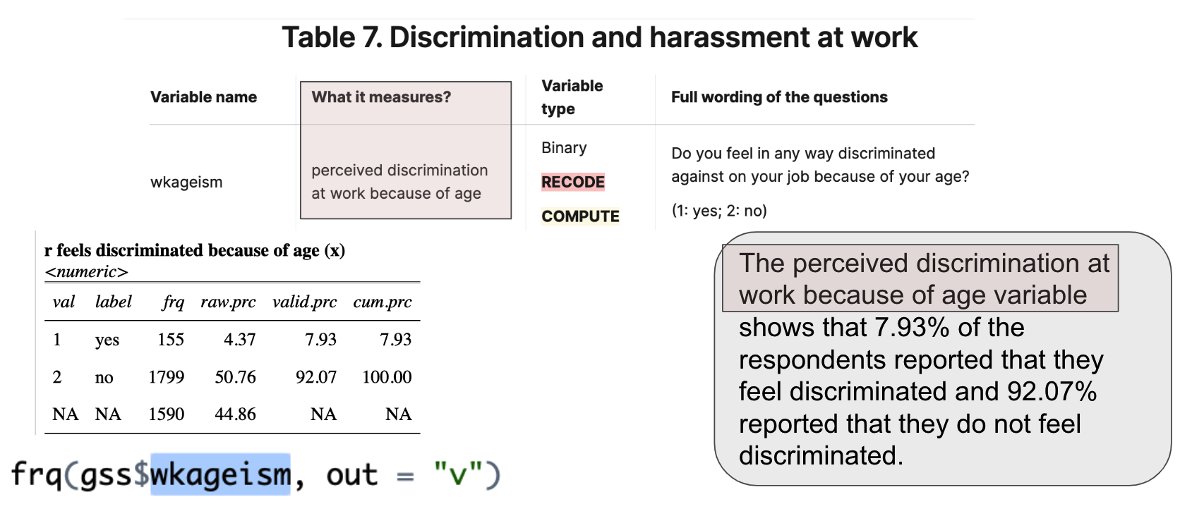
**Example 1:**
{% hint style="success" %} Correct: The perceived discrimination at work because of age variable shows that 7.93% of the respondents feel discriminated at work because of age and 92.07% do not.
{% endhint %}
{% hint style="success" %} Correct: The perceived discrimination at work because of age variable shows that 7.93% of the respondents said yes to being discriminated because of age and and 92.07% said no.
{% endhint %}
{% hint style="danger" %} Wrong: “The wkageism shows that 7.93% of the respondents reported that they feel discriminated and 92.07% do not.
*Do not use variable names in the interpretation. Variable names are meant for coding purposes. There's no word called "wkageism." No one would understand what you mean.*
{% endhint %}
{% hint style="danger" %} Wrong: the r feels discriminated because of age shows that 7.93% of the respondents reported that they feel discriminated and 92.07% do not.
*Do not use the text appears on the top of the table. No one would understand what you mean by "r" here.*
{% endhint %}
**Example 2:**
{% hint style="success" %} Correct: The internet use in hours variable shows the average hours that the respondents use the internet is 15.51, with standard deviation 19.48.
{% endhint %}
{% hint style="danger" %} Wrong: “The wwwhr shows the average hours that the respondents use the internet is 15.51, with standard deviation 19.48.
*Do not use variable names in the interpretation. Variable names are meant for coding purposes. There's no word called "wwwhr." No one would understand what you mean.*
{% endhint %}
{% hint style="danger" %} Wrong: the dd shows the average hours that the respondents use the internet is 15.51, with standard deviation 19.48.
*Do not use the text appears in the table. No one would understand what you mean by "dd" here.*
{% endhint %}
***
## Descriptive statistics
### Frequency tables
[Frequency tables](#user-content-fn-1)[^1] are for [categorical variables](#user-content-fn-2)[^2]
```r
frq(gss$marital, out = "v")
```
val
label
frq
raw.prc
valid.prc
cum.prc
1
married
1462
41.25
41.43
41.43
2
widowed
255
7.20
7.23
48.65
3
divorced
608
17.16
17.23
65.88
4
separated
103
2.91
2.92
68.80
5
never married
1101
31.07
31.20
100.00
NA
NA
15
0.42
NA
NA
{% hint style="info" %}
[*The respondents' marital status variable*](#user-content-fn-3)[^3] *shows that* [*41.43%*](#user-content-fn-4)[^4] *of the respondents are* [*married;*](#user-content-fn-5)[^5] *7.23% of the respondents are widowed; 17.23% of the respondents are divorced; 2.92% of the respondents are separated; 31.20% of the respondents are never married.*
{% endhint %}
{% hint style="success" %}
The \[what it measures column] variable shows that xx.xx% of the respondents are / have / feel / think/ said / reported \[label 1], xx.xx% of the respondents are / have / feel / said / reported \[label 2]...
{% endhint %}
Slides: [descriptive statistics](https://docs.google.com/presentation/d/1_rePJrPIl7rwTEy3pfbrZopgWMFoamw0/edit?usp=sharing\&ouid=100179871492576617561\&rtpof=true\&sd=true)
***
### Descriptive tables 1
[Descriptive tables](#user-content-fn-6)[^6] are for [continuous variables](#user-content-fn-7)[^7].
| Variable | N | Missings (%) | Mean | SD |
| -------- | ---- | ------------ | ----------------------------------------- | ----------------------------------------- |
| dd | 3336 | 5.87 | **49.18** | **17.97** |
{% hint style="info" %}
[*The age in years variable*](#user-content-fn-3)[^3] *shows that the average age of the respondents is* [*49.18*](#user-content-fn-9)[^9]*, with standard deviation* [*17.97*](#user-content-fn-10)[^10]*.*
{% endhint %}
{% hint style="success" %}
The \[what it measures column] variable shows the average \[what it measures column] of the respondents is \[mean], with standard deviation \[SD].
{% endhint %}
Slides: [descriptive statistics](https://docs.google.com/presentation/d/1_rePJrPIl7rwTEy3pfbrZopgWMFoamw0/edit?usp=sharing\&ouid=100179871492576617561\&rtpof=true\&sd=true)
### Descriptive tables 2 (for computed variables)
```r
descr(gss$hapindex, out = "v", show = "short")
```
| dd | 2309 | 34.85 | **2.10** | **0.47** |
| -- | ---- | ----- | ---------------------------------------- | ---------------------------------------- |
Indicate the highest possible score in your interpretation ➜ "Out of 3", "Out of 5", etc.
Indicate the full name of the index variable:
{% hint style="info" %}
*The happiness index score of the respondents is 2.10 out of 3, with standard deviation 0.47.*
{% endhint %}
{% hint style="success" %}
\[The full name of the index variable] score of the respondents is \[mean] out of 3/5/7/10, with standard deviation \[SD].
{% endhint %}
***
## Chi-square
### Chi-square (example 1): insignificant p-value
We utilize crosstabs for chi-square analysis, which is used to discover if there is a relationship between two categorical variables (we check the p value). We refer to statistically significant as p < 0.05. The Chi-Square Test can only compare categorical variables.
```r
sjt.xtab(gss$sex, gss$health, show.row.prc = TRUE)
```
Independent variable first (sex), dependent variable second (health)
| respondents sex | health | | | | Total |
| --------------- | -------------------- | --------------------- | -------------------- | ------------------- | ------------------------------------------- |
| | excellent | good | fair | poor | |
| male |
328 20.2 %
|
821 50.5 %
|
396 24.4 %
|
80 4.9 %
|
1625 100 %
|
| female |
357 18.8 %
|
998 52.6 %
|
441 23.3 %
|
100 5.3 %
|
1896 100 %
|
| Total |
685 19.5 %
|
1819 51.7 %
|
837 23.8 %
|
180 5.1 %
|
3521 100 %
|
| | | χ2=2.248 | df=3 | Cramer's V=0.025 | **p=0.523** |
{% hint style="info" %}
*Respondents' sex has no effect on the condition of health since the p-value is higher than 0.05. We can conclude that males and females have similar condition of health.*
{% endhint %}
{% hint style="success" %}
\[What it measures column of the independent variable] has no effect on \[what it measures column of the dependent variable] since the p-value is higher than 0.05. We can conclude that \[label 1 of the independent variable] and \[label 2 of the independent variable]... have/are/feel... similar \[what it measures column of the dependent variable].
{% endhint %}
Slides: [chisquare](https://docs.google.com/presentation/d/11QlkxBoIM_-wIoBTLYtdXxaELvX664VD/edit?usp=sharing\&ouid=100179871492576617561\&rtpof=true\&sd=true)
### Chi-square (example 2): significant p-value
We utilize crosstabs for chi-square analysis, which is used to discover if there is a relationship between two categorical variables (we check the p value). We refer to statistically significant as p < 0.05. The Chi-Square Test can only compare categorical variables.
```r
gss$agegroups <- rec(gss$age, rec =
"18:39=1 [18-39 age group];
40:59=2 [40-59 age group];
60:89=3 [60-89 age group]", append = FALSE)
sjt.xtab(gss$agegroups, gss$health, show.row.prc = TRUE)
```
Independent variable first (agegroups), dependent variable second (health)
{% hint style="info" %}
*Age group has an effect on the condition of health since the p value is less than 0.05. We can conclude that 18-39 age group, 40-59 age group, and 60-89 age group have substantially different health conditions.*
{% endhint %}
{% hint style="success" %}
\[What it measures column of the independent variable] has an effect on \[what it measures column of the dependent variable] since the p-value is less than 0.05. We can conclude that \[label 1 of the independent variable] and \[label 2 of the independent variable]... have/are/feel... substantially different \[what it measures column of the dependent variable].
{% endhint %}
Slides: [chisquare](https://docs.google.com/presentation/d/11QlkxBoIM_-wIoBTLYtdXxaELvX664VD/edit?usp=sharing\&ouid=100179871492576617561\&rtpof=true\&sd=true)
***
## T-test
### T-test (example 1): insignificant p-value
A t-test is used to determine if there is a significant difference between the means of two groups. A t-test is used when we wish to compare two means (the scores must be continuous).
```r
t.test(educ ~ sex, data = gss) %>%
parameters() %>%
display(format="html")
```
Dependent variable first (educ), independent variable second (sex)
{% hint style="info" %}
*The average education in years of males is 14.08 year, while the average education in years of females 14.15 year. Education in years does not differ by respondents' sex in a statistically significant way since the p-value is higher than 0.05.*
{% endhint %}
{% hint style="success" %}
\[What it measures column of the dependent variable] of \[label 1 of the independent variable] is \[mean] year/dollar/point/score, while \[What it measures column of the dependent variable] of \[label 2 of the independent variable] is \[mean] year/dollar/point/score. \[What it measures column of the dependent variable] does not differ by \[What it measures column of the independent variable] in a statistically significant way since the p-value is higher than 0.05.
{% endhint %}
Slides: [ttest](https://docs.google.com/presentation/d/11hFYVZ3y8pig6n8SkDDnZYk_AoqY2-t9/edit?usp=sharing\&ouid=100179871492576617561\&rtpof=true\&sd=true)
### T-test (example 2): significant p-value
A t-test is used to determine if there is a significant difference between the means of two groups. A t-test is used when we wish to compare two means (the scores must be continuous).
```r
t.test(conrinc ~ sex, data = gss) %>%
parameters() %>%
display(format="html")
```
Dependent variable first (conrinc), independent variable second (sex)
{% hint style="info" %}
*The average personal income in dollars of males is $49,306, while the average personal income in dollars of females is $35,277. Personal income in dollars differs by respondents' sex in a statistically significant way since the p-value is less than 0.05.*
{% endhint %}
{% hint style="success" %}
\[What it measures column of the dependent variable] of \[label 1 of the independent variable] is \[mean] year/dollar/point/score, while \[What it measures column of the dependent variable] of \[label 2 of the independent variable] is \[mean] year/dollar/point/score. \[What it measures column of the dependent variable] differs by \[What it measures column of the independent variable] in a statistically significant way since the p-value is less than 0.05.
{% endhint %}
Slides: [ttest](https://docs.google.com/presentation/d/11hFYVZ3y8pig6n8SkDDnZYk_AoqY2-t9/edit?usp=sharing\&ouid=100179871492576617561\&rtpof=true\&sd=true)
***
## Visualization
### Bar graph (for categorical variables)
```r
plot_frq(gss$marital, type = "bar", geom.colors = "#336699")
```
{% hint style="info" %}
Same as frequency table interpretation
\
\&#xNAN;*The marital status variable shows that 41.43% of the respondents are* *married;* *7.23% of the respondents are widowed; 17.23% of the respondents are divorced; 2.92% of the respondents are separated; 31.20% of the respondents are never married.*
{% endhint %}
{% hint style="success" %}
The \[what it measures column] variable shows that xx.xx% of the respondents are / have / feel / said / reported \[label 1], xx.xx% of the respondents are / have / feel / said / reported \[label 2]...
{% endhint %}
Slides: [visualization](https://docs.google.com/presentation/d/126xQYF33gGKVA_nXDQaGpPy10zXbIDyz?rtpof=true\&usp=drive_fs)
### Histogram (for continuous variables)
```r
plot_frq(gss$educ, type = "hist",show.mean = TRUE, show.mean.val = TRUE, normal.curve = TRUE, show.sd = TRUE, normal.curve.color = "red")
```
{% hint style="info" %}
Same as descriptive table interpretation.
The mean is indicated by ***x***, the standard deviation is indicated by ***s*** (at the very top of the figure).
*The education in years variable shows that the average education in years of the respondents is 14.11, with standard deviation 2.89.*
{% endhint %}
{% hint style="success" %}
The \[what it measures column] variable shows the average \[what it measures column] of the of the respondents is \[mean], with standard deviation \[SD].
{% endhint %}
Slides: [visualization](https://docs.google.com/presentation/d/126xQYF33gGKVA_nXDQaGpPy10zXbIDyz?rtpof=true\&usp=drive_fs)
***
### Stacked bar graphs for multiple variables
```r
graph <- gss %>%
select (conbus, coneduc, confed, conmedic, conarmy, conjudge) %>%
plot_stackfrq(sort.frq = "first.asc", coord.flip = TRUE, geom.colors = "Blues", show.total = FALSE,
title = "Confidence in major US institutions")
# the second part of the code is to change font sizes
graph + theme(
axis.text.x = element_text(size=14), # change font size of x-axis labels
axis.text.y = element_text(size=14), # change font size of y-axis labels
plot.title=element_text(size=20), # change font size of plot title
legend.text = element_text(size=14)) # change font size of legend
```
{% hint style="info" %}
When interpreting stacked bar graphs, we generally interpret one label (response):
\
\&#xNAN;*Of the GSS respondents, 44.2% have a great deal of confidence in the military; 33.4% have a great deal of confidence in medicine; 18.2% in education, 16% in the supreme court; 14.1% in major companies, and 10.4% in the executive branch of government.*
{% endhint %}
{% hint style="success" %}
Of the GSS respondents, xx.xx% are/have/feel/report \[label 1]; xx.xx% are/have/feel/report \[label 2]; xx.xx% are/have/feel/report \[label 3]...
{% endhint %}
Slides: [visualization](https://docs.google.com/presentation/d/126xQYF33gGKVA_nXDQaGpPy10zXbIDyz?rtpof=true\&usp=drive_fs)
***
### Stacked bar graphs by different groups
```r
plot_xtab(gss$dependentvar, gss$independentvar, show.total=FALSE, show.n = FALSE)
```
Independent variable first (agegroups), dependent variable second (conmedic)
{% hint style="info" %}
*30.2% of the 18-39 age group, 32.1% of the 40-59 age group, 38.3% of the 60-89 age group have a great deal of confidence in medicine.*
{% endhint %}
{% hint style="success" %}
xx.xx% of the \[label 1 of the independent variable], xx.xx% of the \[label 2 of the independent variable], xx.xx% of the \[label 3 of the independent variable]... are/have/feel/report \[label and what it measures of the dependent variable].
{% endhint %}
Slides: [visualization](https://docs.google.com/presentation/d/126xQYF33gGKVA_nXDQaGpPy10zXbIDyz?rtpof=true\&usp=drive_fs)
***
## Correlation analyses
### Correlation analysis structure
Correlation analysis examines the linear relationship of two continuous variables.
IF the p-value is statistically significant (<0.05);
* less than |0.3| … weak correlation
* |0.3| < | r | < |0.5| … moderate correlation
* greater than |0.5| ………. strong correlation
The order of the variables does not matter.
### (1a) Correlation analysis table (significant p-value, positive correlation)
```r
tab_corr (gss[, c("sei10", "spsei10")],
wrap.labels = 30, p.numeric = TRUE, triangle="lower", na.deletion = "pairwise")
```
Read "correlation analysis structure" above first.
{% hint style="info" %}
*There is a significant correlation between the socioeconomic index score of the respondents and the socioeconomic index score of the respondents’ spouses since the p-value is less than .05.*
*This correlation is positive and moderate since the r-value is 0.404 (between 0.3 and 0.5).*
*This means that the socioeconomic index score of the respondents and the socioeconomic index score of the respondents’ spouses increase and decrease together.*
{% endhint %}
{% hint style="success" %}
There is a significant correlation between \[what it measures column of variable 1] and \[what it measures column of variable 2] since the p-value is less than .05.
This correlation is positive and weak since the r-value is 0.xxx (less than |0.3|).
**OR** This correlation is positive and moderate since the r-value is 0.xxx (between |0.3| and |0.5|).
**OR** This correlation is positive and strong since the r-value is 0.xxx (higher than |0.5|).
This means that \[what it measures column of variable 1] and \[what it measures column of variable 2] increase and decrease together.
{% endhint %}
Slides: [correlation](https://docs.google.com/presentation/d/12et6ZrFK7B6pE-Wmlz_KVawjebAar9rC/edit?usp=sharing\&ouid=100179871492576617561\&rtpof=true\&sd=true)
***
### (1b) Correlation analysis table (significant p-value, negative correlation)
```r
tab_corr (gss[, c("tvhours", "usetech")],
wrap.labels = 30, p.numeric = TRUE, triangle="lower", na.deletion = "pairwise")
```
Read "correlation analysis structure" above first.
{% hint style="info" %}
*There is a significant correlation between television screen time and percentage of time use at work using electronic technologies since the p-value is less than .05.*
*This correlation is negative and weak since the r-value is -0.111 (less than |0.3|).*
*This means that as the television screen time increases, the percentage of time use at work using electronic technologies decreases, and vice versa.*
{% endhint %}
{% hint style="success" %}
There is a significant correlation between \[what it measures column of variable 1] and \[what it measures column of variable 2] since the p-value is less than .05.
This correlation is negative and weak since the r-value is -0.xxx (less than |0.3|).
**OR** This correlation is negative and moderate since the r-value is -0.xxx (between |0.3| and |0.5|).
**OR** This correlation is negative and strong since the r-value is -0.xxx (higher than |0.5|).
This means that as \[what it measures column of variable 1] increases \[what it measures column of variable 2] decreases, and vice versa.
{% endhint %}
### (1c) Correlation analysis table (insignificant)
```r
tab_corr (gss[, c("age", "educ")],
wrap.labels = 30, p.numeric = TRUE, triangle="lower", na.deletion = "pairwise")
```
{% hint style="info" %}
*There is no significant correlation between the age of the respondents and the years of education since the p-value is higher than .05.*
*This means that the age of the respondents and the years of education do not increase and decrease together.*
{% endhint %}
{% hint style="success" %}
There is a no significant correlation between \[what it measures column of variable 1] and \[what it measures column of variable 2] since the p-value is higher than .05.
This means that \[what it measures column of variable 1] and \[what it measures column of variable 2] do not increase and decrease together.
{% endhint %}
### (2) Correlation scatterplot graph
xlab: "what it measures column" of variable 1 (x)
ylab: "what it measures column" of variable 2 (y)
```r
scatterplot <- ggscatter(gss, x = "tvhours", y = "usetech",
add = "loess", conf.int = TRUE, color = "black", point=F,
xlab = "Television screen time", ylab = "Percentage of time use at work using electronic technologies")
scatterplot + stat_cor(p.accuracy = 0.001, r.accuracy = 0.01)
```
{% hint style="info" %}
Same interpretation as correlation analysis table:
*There is a significant correlation between television screen time and percentage of time use at work using electronic technologies since the p-value is less than .05.*
*This correlation is negative and weak since the r-value is -0.11 (less than |0.3|).*
*This means that as the television screen time increases, the percentage of time use at work using electronic technologies decreases, and vice versa.*
{% endhint %}
Slides: [correlation](https://docs.google.com/presentation/d/12et6ZrFK7B6pE-Wmlz_KVawjebAar9rC/edit?usp=sharing\&ouid=100179871492576617561\&rtpof=true\&sd=true)
***
### (3) Correlation matrix
Correlation matrix examines the linear relationship of multiple continuous variables.
```r
tab_corr (gss[, c("sei10", "spsei10", "tvhours", "usetech", "age", "educ", "marasiannew", "marhispnew")],
wrap.labels = 30, p.numeric = TRUE, triangle="lower", na.deletion = "pairwise")
```
{% hint style="info" %}
Same interpretation as correlation analysis table and scatterplot graph:
*There is no significant correlation between the age of the respondents and the percentage of time use at work using electronic technologies since the p-value is higher than .05.*
*This means that the age of the respondents and the percentage of time use at work using electronic technologies do not increase and decrease together.*
{% endhint %}
Slides: [correlation](https://docs.google.com/presentation/d/12et6ZrFK7B6pE-Wmlz_KVawjebAar9rC/edit?usp=sharing\&ouid=100179871492576617561\&rtpof=true\&sd=true)
***
### (4) Scatterplot matrix
Scatterplot matrix examines the linear relationship of multiple continuous variables.
```r
pairs.panels(gss[, c("sei10", "spsei10", "tvhours", "usetech", "age", "educ", "marasiannew", "marhispnew")],
ellipses=F, scale=F, show.points=F, stars=T, ci=T)
```
{% hint style="info" %}
Same interpretation as correlation analysis table and scatterplot graph:
*There is a significant correlation between television screen time and the age of the respondents since the p-value is less than .05.*
*This correlation is positive and weak since the r-value is 0.24 (less than |0.3|).*
*This means that television screen time and the age of the respondents increase and decrease together.*
{% endhint %}
Slides: [correlation](https://docs.google.com/presentation/d/12et6ZrFK7B6pE-Wmlz_KVawjebAar9rC/edit?usp=sharing\&ouid=100179871492576617561\&rtpof=true\&sd=true)
***
### (5) Correlogram
Correlogram examines the linear relationship of multiple continuous variables.
```r
selectedvariables <- c("sei10", "spsei10", "tvhours", "usetech", "age", "educ", "marasiannew", "marhispnew")
testRes = cor.mtest(gss[, selectedvariables])
gssrcorr = rcorr(as.matrix(gss[, selectedvariables]))
gsscoeff = gssrcorr$r
corrplot(gsscoeff, p.mat = testRes$p, method = 'pie', type = 'lower', insig='blank',
addCoef.col = 'black', order = 'original', diag = FALSE)$corrPos
```
{% hint style="info" %}
Same interpretation as correlation analysis table and scatterplot graph:
*There is a significant correlation between television screen time and socio-economic index score of the respondents since the p-value is less than .05.*
*This correlation is negative and weak since the r-value is -0.15 (less than |0.3|).*
*This means that as the socio-economic index score of the respondents increases, the television screen time decreases, and vice versa.*
{% endhint %}
Slides: [correlation](https://docs.google.com/presentation/d/12et6ZrFK7B6pE-Wmlz_KVawjebAar9rC/edit?usp=sharing\&ouid=100179871492576617561\&rtpof=true\&sd=true)
***
## Linear regression analysis
In regression, we explain the effects of independent variables on the dependent variable by estimating how changes in the independent variables are associated with changes in the dependent variable.\
Unlike correlation analysis, regression analysis can be used to determine the direction and strength of a potential causal relationship.
```r
model4 <- lm(conrinc ~ god + age + physhlth + educ, data = gss)
tab_model(model4, show.std = T, show.ci = F, collapse.se = T, p.style = "stars")
```
Dependent variable (conrinc) first, followed by the independent variables separated by a plus (+).
### Linear regression analysis interpretation breakdown
{% hint style="success" %}
**First paragraph:** \[The significance levels] Mention which variables (“what it measures”) are statistically significant (if any), and which variables are statistically insignificant (if any). Variables with at least one asterisk (\*) are statistically significant.
*Respondents’ age, days of poor physical health past 30 days, and respondents' education in years are statistically significant predictors of respondents’ personal income since the p values are less than 0.05. Respondent's confidence in the existence of God is not a statistically significant predictor of respondents’ personal income since the p value is greater than 0.05.*
*\[What it measures column of significant independent variable 1], \[what it measures column of significant independent variable 2], and \[what it measures column of significant independent variable 3]... are statistically significant predictors of \[what it measures column of the dependent variable] since the p values are less than 0.05. \[What it measures column of insignificant independent variable 1], \[what it measures column of insignificant independent variable 2]... are not a statistically significant predictor of \[what it measures column of the dependent variable] since the p value is greater than 0.05.*
**Second paragraph:** \[The explanation of coefficients (Estimates column)] Mention how significant independent variables increase or decrease the value of the dependent variable, using the “Estimates” column. When reporting the estimates (coefficients), ensure that the sentence includes the units (one unit, a day, a score, a year, a dollar, etc.) of both the independent and the dependent variable.
*A year increase in respondents’ age increases respondents’ personal income by $504. A day increase in poor physical health past 30 days decreases respondents’ personal income by $857. A year increase in the respondents’ education increases respondents’ personal income by $4,845.*
*A \[unit/day/score,year,dollar] increase in \[what it measures column of significant independent variable 1] increases \[what it measures column of the dependent variable] by \[estimates column with the unit of analysis]. A \[unit/day/score,year,dollar] increase in \[what it measures column of significant independent variable 2] increases \[what it measures column of the dependent variable] by \[estimates column with the unit of analysis]. A \[unit/day/score,year,dollar] increase in \[what it measures column of significant independent variable 3] increases \[what it measures column of the dependent variable] by \[estimates column with the unit of analysis]....*
**Third paragraph:** \[The explanation of standardized betas (std.Beta column)] Mention the strongest predictors (variables) of the dependent variable using the “std.Beta” (standardized beta) column in order. Only mention the statistically significant ones. “std.Beta” is an absolute number, which means -.56 is stronger than .45.
*The strongest predictor of respondents’ personal income is the respondents' education in years (std.Beta=0.34), followed by respondents’ age (std.Beta=0.17), and the days of poor physical health past 30 days (std.Beta=-0.13).*
*The strongest predictor of \[what it measures column of the dependent variable] is the \[what it measures column of significant independent variable 1] (std.Beta=0.xx), followed by \[what it measures column of significant independent variable 2] (std.Beta=0.xx), and \[what it measures column of significant independent variable 3] (std.Beta=0.xx).*
**Fourth paragraph:** \[The explanation of R-squared] Report the adjusted R-squared value as a percentage with the statistically significant variables.
*The adjusted R squared value indicates that 17.2% of the variation in respondents’ personal income can be explained by the respondents’ age, days of poor physical health past 30 days, and respondents' education in years.*
*The adjusted R squared value indicates that \[R2 squared] of the variation in \[what it measures column of the dependent variable] can be explained by \[what it measures column of significant independent variable 1], \[what it measures column of significant independent variable 2], \[what it measures column of significant independent variable 3]...*
{% endhint %}
### Reporting of estimates (coefficients)
{% hint style="info" %}
When reporting the estimates (coefficients), ensure that the sentence includes the units (one unit, score, year, dollars, etc.) of both the independent and the dependent variable.
* Independent variable (physhlth - days of physical issues during the past 30 days - 0-30 days)
* Dependent variable (conrinc - personal income in dollars - $336 - $170,913)
A day increase in physical issues during the past 30 days decreases personal income by $857.
* Independent variable (age - age in years - 18-89 age)
* Dependent variable (polviews - conservatism level - 1: extremely liberal; 7: extremely conservative)
A year increase in age increases conservatism level by 2.45 points.
* Independent variable (rank - social ranking level - 10: top; 1: bottom)
* Dependent variable (educ - education in years - 0-20 years)
A one unit increase in social ranking level increases respondents’ education by 3.19 years.
{% endhint %}
### Reporting of adjusted R-squared
{% hint style="success" %}
The adjusted R-squared shows whether adding additional independent variables improve a regression model or not.
\
The adjusted R-squared should be reported as a percentage.
Here's a shortcut for converting a number with decimals to a percentage:
If 0.007 is the adjusted R-square, then move the dot two times to the right:
0.007 ➜ 0.7%
0.079 ➜ 7.9%
0.172 ➜ 17.2%
{% endhint %}
Slides: [linear regression](https://docs.google.com/presentation/d/16v4ZKqgEw2Ah0i0g9jC8Ex1WY3rMvjPi/edit?usp=sharing\&ouid=100179871492576617561\&rtpof=true\&sd=true)
***
## Linear regression analysis (with dummy variables)
```r
model6 <- lm(conrinc ~ god + age + physhlth + educ + male + veryhappy + prettyhappy , data = gss)
tab_model(model6, show.std = T, show.ci = F, collapse.se = T, p.style = "stars")
```
{% hint style="info" %}
*Age of the respondents, days of poor physical health past 30 days, the years of education, being male, being very happy, and being pretty happy are statistically significant predictors of respondents’ income since the p values are less than 0.05. Respondent's confidence in the existence of God is not a statistically significant predictor of respondents’ income since the p value is greater than 0.05.*
*A year increase in age increases respondents’ income by $489. A day increase in poor physical health past 30 days decreases respondents’ income by $654. A year increase in the years of education increases respondents’ income by $5,185. Being male increases income by $15,624 compared to being female. Being very happy increases income by $15,779 compared to being not too happy. Being pretty happy increases income by $8,908 compared to being not too happy.*
*The strongest predictor of respondents’ income is the years of education (std.Beta=0.36), followed by being male (std.Beta=0.19), the age of the respondent (std.Beta=0.17), being very happy (std.Beta=0.16), being pretty happy (std.Beta=0.11), and the days of poor physical health past 30 days (std.Beta=-0.10).*
*The adjusted R squared value indicates that 22.2% of the variation in respondents’ income can be explained by the years of education, age of the respondents, and days of poor physical health past 30 days, being male, being very happy, and being pretty happy.*
{% endhint %}
### Reporting of dummy variable estimates (coefficients)
{% hint style="success" %}
When reporting the coefficients of dummy variables, ensure that the sentence includes "being" or "having," as well as the omitted (comparison) dummy variable.
This is because creating dummy variables essentially means creating new variables, which changes the information they measure (aka "what it measures").
For example, if you create "male" and "female" dummy variables based on the "respondents' sex" variable, the "male" dummy variable now measures "being male," and the "female" dummy variable now measures "being female."
* Being male increases income by $15,624 compared to being female.
If you create "veryhappy," "prettyhappy," and "nottoohappy" dummy variables based on the "happiness level" variable, the "veryhappy" dummy variable now measures "being very happy," the "prettyhappy" dummy variable measures "being pretty happy," and the "nottoohappy" dummy variable measures "being not too happy."
* Being very happy increases income by $15,779 compared to being not too happy.
* Being pretty happy increases income by $8,908 compared to being not too happy.
If you create "ownhouse" and "renthouse" dummy variables based on the "home ownership" variable, the "ownhouse" dummy variable now measures "having a house" (or "owning a house"), and the "renthouse" dummy variable measures "renting a house."
* Having a house increases life satisfaction by 3.2 points compared to renting a house.
OR
* Owning a house increases life satisfaction by 3.2 points compared to renting a house.
{% endhint %}
Slides: [linear regression](https://docs.google.com/presentation/d/16v4ZKqgEw2Ah0i0g9jC8Ex1WY3rMvjPi/edit?usp=sharing\&ouid=100179871492576617561\&rtpof=true\&sd=true)
Slides: [dummy variables](https://docs.google.com/presentation/d/14DvMvFfpo0zkmWruZhdPP7KSxzAQ0ViG?rtpof=true\&usp=drive_fs)
***
## Logistic regression analysis (with dummy variables)
```r
frq(gss$class, out = "v")
gss$higherclass <- ifelse(gss$class == 3 | gss$class == 4, 1, 0)
gss$lowerclass <- ifelse(gss$class == 1 | gss$class == 2, 1, 0)
frq(gss$wrkslf, out = "v")
gss$selfemployed <- ifelse(gss$wrkslf == 1, 1, 0)
gss$workforsomeoneelse <- ifelse(gss$wrkslf == 2, 1, 0)
frq(gss$race, out = "v")
gss$white <- ifelse(gss$race == 1, 1, 0)
gss$nonwhite <- ifelse(gss$race == 2 | gss$race == 3, 1, 0)
model1 <- glm(higherclass ~ selfemployed + educ + nonwhite, data = gss, family = binomial(link="logit"))
tab_model(model1, show.std = TRUE, show.ci = FALSE, collapse.se = TRUE, p.style = "stars")
```
{% hint style="info" %}
Education in years and being non-white are significant predictors of being higher class since the p values are less than 0.05. Being self-employed is not a significant predictor of being higher class since the p value is greater than 0.05.
A year increase in education increases the probability of being higher class by 1.30 times. Being non-white decreases the probability of being higher class by 1.66 times compared to being white.
The strongest predictor of being higher class is education in years (std.Beta=2.10), followed by being non-white (std.Beta=1.25).
The Tjur R-squared value indicates that 12.3% of the variation in being higher class can be explained by education in years and being non-white.
{% endhint %}
### Logistic regression analysis interpretation breakdown
{% hint style="info" %}
**First paragraph:** \[The significance levels] Mention which variables (“what it measures”) are statistically significant, and which variables are statistically insignificant. Variables with at least one asterisk (\*) are statistically significant
*Education in years and being non-white are significant predictors of being higher class since the p values are less than 0.05. Being self-employed is not a significant predictor of being higher class since the p value is* greater *than 0.05.*
**Second paragraph:** \[The explanation of odd ratios] Mention how independent variables increase or decrease the probability of the dependent variable happening, using the “Odd ratios” column. When reporting the Odd ratios, ensure that the sentence includes the units (one unit, score, year, dollars, etc.) of the continuous independent variables. When reporting the Odd ratios of the dummy independent variables, ensure that the sentence mentions the comparison category. When reporting the negative Odd ratios of the dummy independent variables, make sure to divide 1 by the Odd ratios
*A year increase in education increases the probability of being higher class by 1.30 times. Being non-white decreases the probability of being higher class by 1.66 times compared to being white.*
**Third paragraph:** \[The explanation of standardized betas (std.Beta column)] Mention the strongest predictors (variables) of the dependent variable using the “std.Beta” (standardized beta) column in order. When reporting the negative standardized betas of the dummy independent variables, make sure to divide 1 by the standardized betas
*The strongest predictor of being higher class is education in years (std.Beta=2.10), followed by being non-white (std.Beta=1.25).*
**Fourth paragraph:**
*The Tjur R-squared value indicates that 12.3% of the variation in being higher class can be explained by education in years and being non-white.*
{% endhint %}
### Reporting the Odd Ratios of continuous and dummy independent variables
{% hint style="info" %}
When reporting the odd ratios of continuous independent variables ensure that the sentence includes the units (one unit, score, year, dollars, etc.) of the independent variable. The sentence should end with times.
* Independent variable (age - age in years - 18-89 age)
* Dependent variable (higherclass - being higher class)
A year increase in age increases the probability of being higher class by 1.15 times.
* Independent variable (rank - social ranking level - 10: top; 1: bottom)
* Dependent variable (higherclass - being higher class)
A one unit increase in social ranking level increases the probability of being higher class by 2.89 times.
When reporting the odd ratios of dummy independent variables, ensure that the sentence includes "being" or "having," as well as the omitted (comparison) dummy variable.
This is because creating dummy variables essentially means creating new variables, which changes the information they measure (aka "what it measures").
For example, if you create "white" and "non-white" dummy variables based on the "respondents' race" variable, the "white" dummy variable now measures "being white," and the "non-white" dummy variable now measures "being non-white."
* Being white increases the probability of being higher class by 1.66 times compared to being non-white.
{% endhint %}
### Reporting the negative odd ratios and Std.Betas
If the odd ratio is less than 1, it is negative
Negative Odds Ratio =
1➗ Odd Ratio
* Type “calculator” on Google
* Divide 1 by the Odd Ratio
1➗ 0.60 = 1.66
If the odd ratio is less than 1, the standardized beta is also negative:
Negative Std.Beta =
* Divide 1 by the Std.Beta
1➗ Std.Beta
1➗ 0.80 = 1.25
### Reporting of Tjur R-Squared
{% hint style="success" %}
The Tjur R-Squared shows whether adding additional independent variables improve a logistic regression model or not.
\
The Tjur R-Squared should be reported as a percentage.
Here's a shortcut for converting a number with decimals to a percentage:
If 0.007 is the Tjur R-Squared, then move the dot two times to the right:
0.007 ➜ 0.7%
0.079 ➜ 7.9%
0.172 ➜ 17.2%
{% endhint %}
Slides: [logistic regression](https://docs.google.com/presentation/d/14fc8Ah_rc1DwYrfIhLHDF5PTJZCtVWaj?rtpof=true\&usp=drive_fs)
Slides: [dummy variables](https://docs.google.com/presentation/d/14DvMvFfpo0zkmWruZhdPP7KSxzAQ0ViG?rtpof=true\&usp=drive_fs)
[^1]: The “Frequencies” command counts up how many times categories of a variable appears.
We always check the ***valid.prc*** column (valid percentage).
[^2]: Categorical variables take on values that are names or labels, not real numbers.
Check out the numbers under the "val" column. **1** is for married, **2** is widowed, **3** is divorced, etc.
These numbers are arbitrary. In other words, widowed people (2) are **NOT** double of married people (1).
[^3]: use "what it measures" column of Variables in GSS page.
[^4]: Always use "valid.prc" (valid percent) column of the tables.
[^5]: use the labels.
[^6]: The “Descriptives” command is used to determine mean, standard deviation.
[^7]: Continuous variables are numeric variables that have an infinite number of values between any two values, with each point placed at an equal distance from one another.
F
[^8]: replace age with a new continuous variable.
[^9]: Mean
[^10]: SD: standard deviation.